
It is the nature of explanation that we account for something in terms of something else. Analytic data methods aimed at explanation utilize a Y-frame that denotes the set of things we are trying to account for, and an X-frame that is the set of things doing the explaining.
In traditional practice a regression model is proposed to capture the linkage between X and Y. The model’s parameters are then estimated from empirical data to maximize the linkage through minimizing the model’s prediction error. Commonly there is little theory to guide model selection, and beyond a total of three-dimensions there is no way to directly visualize the empirical evidence to guide the choice. Modeling is, and will remain, a technical art.
Modeling usefully forces deeper thinking in order to advance understanding. When we understand something, we can make better predictions and decisions. The reverse is not true. The ability to make good predictions does not mean you understand it. Most people can stare at a mathematical model and glean little from it. And it’s often tough to translate models into words.
There is a disconnect between mathematical models and the way people think and talk, but there is a direct parallel. People use mental models based on knowledge and experience all the time. Human explanations of quantitative ideas reveal the frames they are using; the noun concepts (dimensions) associated with “what” they are explaining is the Y-frame, and the noun concepts invoked to “do the explaining” are the X-frame. How brains accomplish this may never be known, the nature of the form of how people explain things in language is transparent to all native speakers. Language is the human currency of communication, not math.
This presentation provides an overview of how the task of explanation is approached in Polynary. Just like regression-type problems, the Y-frame is a set of dimensional concepts that reflect “what is being explained” and the X-frame is a set of dimensional concepts that are “doing the explaining”. In this example we examined how three important criteria for waitstaff suitability depends on their personality using a variety of views. Problems analogous to this are common in data analysis.
We illustrate the Polynary approach to the task of explanation through the following example. While it is not necessary in order to proceed, you can follow along In the Polynary program by logging into Polynary Service and in the Public Sandbox data library, and under the Personality and Waitstaff Suitability data set selecting the model hi-lighted below. Instructions to navigate in the program are shown [bold in brackets].

Explain how Waitstaff Suitability Depends on Personality
[Reorder the X-Frame to “o c a e n”. Change Intervals slider to 4. In the tool menu change the Tilt Angle to 35 and in palette Generation select Lightness and Ascending. Set intervals to 4.]
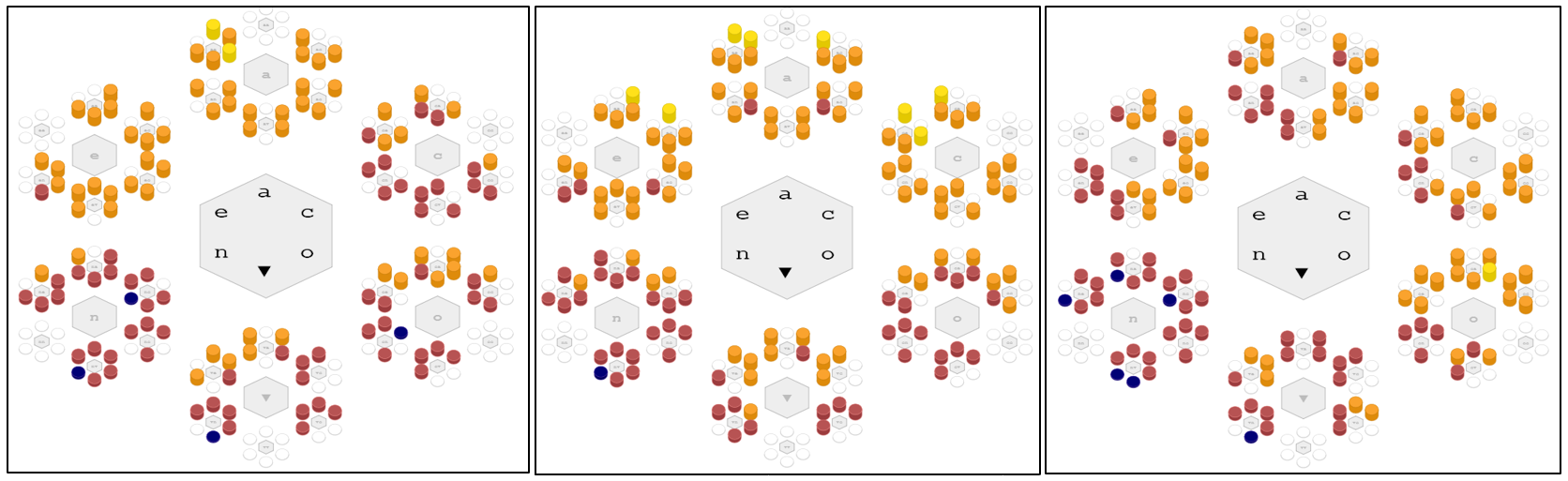
The graph of the X-frame shows the five personality dimensions. The height of each bar on the graph indicates the relative number of cases falling in each basin. In this problem, the judgement of a waitperson’s suitability incorporates three different outcome dimensions; respectful co-worker relations, alignment with management, and customer success.

The colors on this first graph show the relation of personality to co-worker Respect. Respect is divided into four levels, a number we can change with the Intervals slider. What is important to note here is the outcomes represent equal intervals of scale. Average Respect is a gauge of how well one gets along with the other staff, with higher values desirable. Notice that the colors do not appear randomly scattered around the graph—it seems a staff’s personality matters in co-worker relationships.
A second measure of fitness is how well the employee’s demeanor aligns with management’s goals. Assessed by managers, personalities with larger values of average Alignment are desirable. [In the left hand menu, click on A: Alignment]
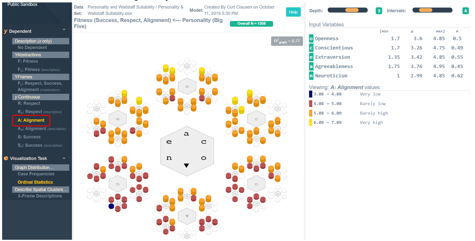
While the distribution of colors is somewhat different from those for Respect, personality also seems to matter in average Alignment.
yContinuous= Respect yContinuous = Alignment

Another important aspect is their Success with customers. This indicator is assessed by their tip rate in the belief that sensitive customer engagement increases a person’s tips. [In left menu click on Success.] Again, average Success seems to depend on personality.

Non-random color distributions are indicative of patterns that help us understand the relationships in data based on empirical evidence.
Respect Alignment Success
Ideally, a worker should score high on all three of these aspects. But we have seen that these graphs look different. Identifying personalities that optimize one aspect may perform poorly on the others. To address this problem, we created an abstraction called Fitness. It is an abstraction variable sensitive to jointly larger values across all three measures. It is closer to the broader concept of what we mean by suitability. Larger values of Fitness are associated with more suitable waitstaff. Let’s look at the graph for Fitness. [Click on Fitness]

As before, we notice that the colors do not appear randomly distributed. Particularly, the lowest values of average Fitness are associated with the large number of blue basins that appear in the “n” region of the graph. This is where Neuroticism is relatively high compared to the other personality dimensions. This trait characterizes people most notable in two aspects, volatility and withdrawnness. If you think about it, it is easy to speculate why this might be so in the social environment of a restaurant.
Notice that the color bins represent equally spaced intervals of the Fitness scale. In this type of view, this will be the case no matter how many intervals we choose. An alternative approach is to create these intervals based on the distribution of the outcome variable itself. Specifically, the method of natural clusters builds these intervals of scale centered around locally dense regions of data cases within outcome space. The resulting intervals generally become unequal in width, but their descriptions offer the most concise summary of data itself. [In the left hand menu Click Fitness (descriptive; change graph resolution to 2)]
In this view, the graph shows the relative frequency of people fitting each description within each personality profile. Rather than the average Fitness shown earlier, these pie charts demonstrate the variation in Fitness associated with each profile. It demonstrates that Fitness cannot be perfectly predicted, but the personality profile appears to change the likelihood of Fitness. This view provides a more nuanced hiring judgement.

A reliable judgement must be evaluated in the context of the number of cases observed falling within a given basin. This information is obtained by hovering the mouse over the basin in question and right-clicking on it for more empirical detail. For example, when we hover the mouse over basin “ae” we see a pop-up box showing a raw data summary of 99 people characterized by a personality where Agreeableness then Extraversion are the two most notable features of their personality.
[Right click on Basin ‘ae’ and select Statistics] We the X-frame and Y-frame summary statistics are displayed. Given the number of people fitting each description is different, we see that the relative probability that a person characterized by “ae” is most likely to fit the first description (60.88%). Most of the remaining cases fitting the second description (35.26%). That is, over 96% of individuals with personality profile “ae” have an overall Fitness that is at least quite high.
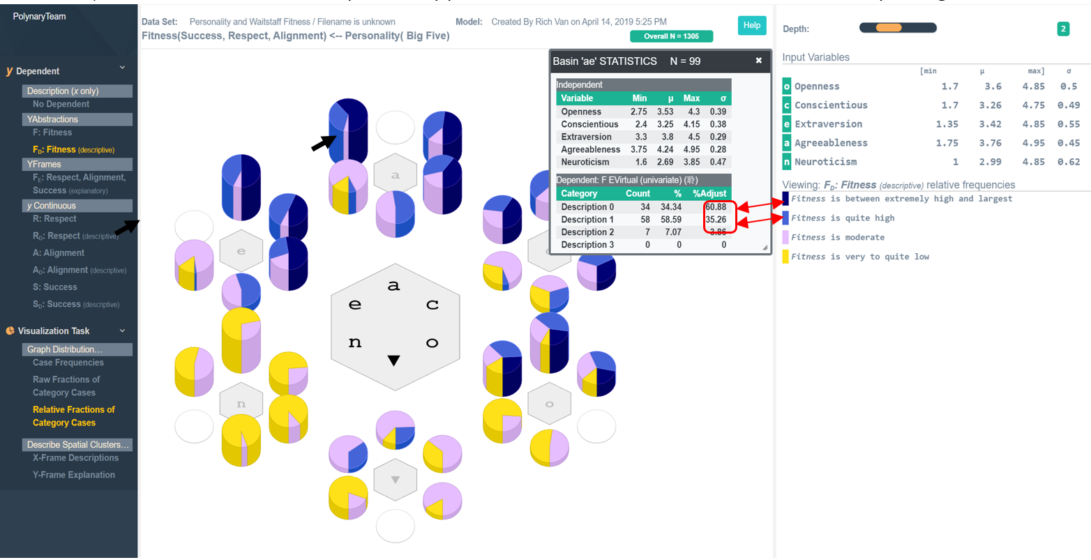
This is not the only profile on the graph with high Fitness. For example, 93% of individuals with profiles denoted by basin “ea” also have Fitness scores that are at least quite high.

What this makes clear is people high in both Extraversion and Agreeableness are good candidate choices, while many others are not.
In creating the abstraction Fitness, we simplified the problem. We created a single composite outcome variable out of three important considerations of job suitability. This is not always possible or desirable. As originally proposed the aim is to relate three output variables in terms of the five personality dimensions. This is analogous to doubly multivariate regression problems in statistics. In creating Fitness, we lost information. There may be many combinations of the three input variables that lead to the same level of overall Fitness, and thus far we have not been able to distinguish between them. There is a view to address this need: [Under YFrames click on FE: Respect, Alignment, Success (Explanatory)]

In this view, we applied the Method of Natural Clusters on the three-dimensional outcome space to yield four concise descriptions that summarize observed combinations of outcomes. Each case becomes classified into one of these four conceptual bins. The pie chart of each basin reveals the relative likelihood that people fit each of these color-coded descriptions. In looking over the four outcome descriptions, personalities dominated by the yellow basins appear to be the most desirable employees.
As with Fitness, the preponderance of light purple colored cases in the “n” region appear as the least suitable—this is where Neuroticism is the dominant personality feature. The personalities shown in light purple are folks where Success is very low, Respect is extremely to somewhat low, and Alignment is low. As a generalization, we can now better explain why Neurotic people appear to be the least Fit.
This view is important because we may be less concerned about overall Fitness than a specific aspect of it. For example, we may know that costly turnover rates are lower for more Successful staff while training programs can better address deficiencies in Alignment and Respect.
And in this view, we better see the importance of Openness as a personality trait. Yellow dominates three basins in the “o” region, “oe”, “oa” and “o”, where it is the most salient personality feature. And three additional basins in the are dominated by yellow as well: basins “eo, “ao”, and “co”. These basins contain the people with Openness as their second most dominant personality factor. This pattern was not as conspicuous in the earlier data views.
In the final view we summarize the connection of Personality to Suitability through a much smaller set of generalizations. These are derived from treating the four Y-descriptions as categories and processing them as a classification problem. [Click on Y-frame Explanation] This summary reflects the same terms in which we initially posed the problem. And rather than using mathematical models that few can interpret, we express the empirical findings in words that people already understand.

In this graph each color represents a spatially connected set of basins that define a contiguous region of personality space. (Hovering the mouse, over say the red basins, reveals how they connect.) In the Legend, we see the set of color-coded personality descriptions positively related in a significant way to each of the four Suitability characterizations. For example, we can scroll-down to look at the relationship between Suitability and Personality for the red cluster at the very bottom of the Legend.

Almost 13% (166/1305) of the people in the sample have Suitability characterized as: Success is quite to extremely high and Respect and Alignment exceptionally moderate to quite high. 84.3% of the people so characterized have Personalities somewhat to extremely high in Openness, low to somewhat high neuroticism, quite low to high Agreeableness with very low to high Extroversion, and low to very high Conscientiousness. This characterization covers all the people that fall into the red basins.

A formal description of a 5-D personality frame requires five adverb-adjective phrases. It is rare to hear descriptions that ramble on this long. People simplify descriptions by making them brief. Brief comes from Latin meaning to “cut-off”. To this end, the program orders the adverb-adjective phrases in a description by the amount of accurate information it conveys to a general hearer of that phrase.
[Set the %Comp slider to 80% ,then right click any red basin and select Explanation] We see a generalization that summarizes a significant positive connection between personality of members of the red cluster) and their associated fitness as waitstaff. Each description is 92% accurate and retains at least 80% of the information in their complete description. The shortened generalization still empirically valid and easier to hold in mind or communicate. Of the 325 people falling within this personality description, 43.1% fall within this fitness characterization. This is 3.4 times more than expected by chance.
There is an analogous generalization for each color on the graph. In the current version of this program we show all the positive, statistically significant associations between the X-clusters (personalities) and Y-clusters (fitness). In effect, these empirically derived generalizations state what the relationship ‘is’. A planned feature enhancement will report the significant negative relations as well. There is potentially useful information in stating what the relationships are ‘not’. More broadly, we will report the table of the two-way confusion matrix between the X-clusters and Y-clusters to ground us to all the empirical evidence in the data.
Summary Comments
We have provided an overview of how the task of explanation is approached in Polynary. In this example we examined how three important criteria for waitstaff suitability depend on their personality using a variety of views.
Explanations contain two language descriptions joined into a single statement with logical form: IF or When (X-description) THEN (Y-description). Each of these descriptions connote the location, size, and shape of a region within their respective dimensional spaces. In this example, we see that an explanation is understood geometrically as a mapping between a region of a 5-D space to a region of a 3-D space. The set of statements connecting these two spaces reveal the nature of the patterns embedded in the empirical data.
Mathematical models also define IF/THEN relations, but in a point-wise fashion. You apply the X-values to it, turn the computational crank, and it spits out specific predicted values. This gives models the air of exactitude. This impression arises because we tend to ignore the uncertainties in model predictions. Further, the point-wise mapping of X to Y values in models makes their interpretation difficult. The reason is that the information in data is in the patterns and relationships formed by collections of objects, and these features only exist over regions of space, not points.
The Polynary approach avoids modeling and its attendant assumptions. The rationale behind Polynary methods is understood through spatial reasoning. The methods begin by noting that polynary strings partition a conceptual space of one or more dimensions into a set of mutually exclusive and exhaustive chunks of space called basins. A unique polynary string labels each basin.
Data cases falling into the same basin are similar; this similarity increases with the length of the polynary string. Polynary graphs show the relative number of cases falling into each basin through the relative height of a bar over each polynary string. Such graphs show the multivariate frequency distribution of the empirical data. Historically, these distributions were impossible to construct for data beyond two-dimensions.
A polynary graph displays basins organized by the spelling of their strings. The order of the symbols in these strings reveal the order that its dimensional features stand out. The longer the spelling of two strings agree, the more similar two objects are. The reason is simple, as the length of the string increases, the corresponding geometric region of space it denotes becomes smaller.
The compromise that enables high-dimensional visualization comes from a willingness to sacrifice details about the objects. This feels troubling until one appreciates that data analysis is about reducing the overwhelming numeric details of data into a limited set of generalizations. These generalizations are made across objects found within subregions of the data space; the language descriptions involved connote the location, size, and shape of these subregions The endgame is not about reproducing the numeric detail of the data; it is about providing the detail needed to characterize the patterns or relationships within it.
© PolynaryThink, LLC 2019 All Rights Reserved