
A common type of problem in statistics is predicting the category of an object based on its measurable properties. For instance, who will live or die from a surgery based on characteristics like age, blood pressure, and so on. These classification rules are based on cases where the category of each object is known, and their associated quantitative properties measured. A well-known statistical method called Discriminant Functions makes the prediction of category membership through rules expressed as equations.
A well-known example of Discriminant Functions uses R. A. Fisher’s Iris data. The task is to predict the species of Iris from measurements taken on the plant. The mathematical form of the Discriminant Function results looks like this:
Iris setosa = -56.87 + 33.15*Sepal Width + 2.05*Petal Width – 22.50*Sepal Length
Iris versicolor = -58.53+ 12.92*Sepal Width + 16.63*Petal Width + 6.37*Sepal Length
Iris virginica = -96.43 + 8.41*Sepal Width + 21.19*Petal Width + 23.34*Sepal Length
The classification rule is that you plug the values of a plant’s Sepal Width, Petal Width, and Sepal length into each of the three equations shown above. You then assign that Iris to whichever equation has the largest numeric value.
This is an explicit mathematical rule to classify a given plant, but most people can stare at these equations all day and they still don’t understand much about what distinguishes these Irises. If people used mathematical decision rules our back pockets would be stuffed with equations. They are not. People encapsulate and integrate knowledge, and share it with others, through generalizations expressed in written or spoken language. To this end, mathematical expressions (and Big Data methods) are of little help. Analytic methods shape more than what we know, they shape how we know it.
In this presentation we visit the classification task using Polynary. Through the Iris data, we will illustrate the visualization tools for data exploration then distinguish these Iris kinds through ordinary language descriptions
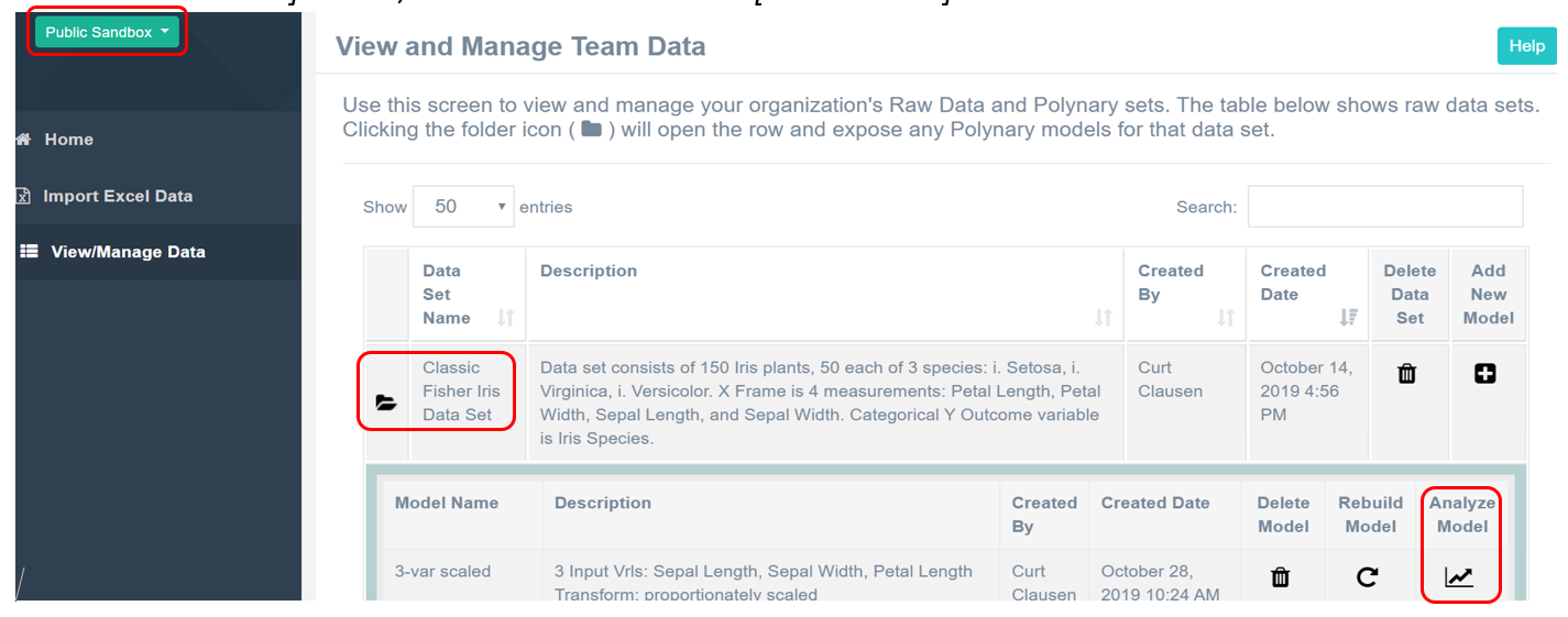
Note: If you have a Polynary account you can you can replicate the graph views presented by following the directions [bracketed in italics]. On the Home Screen go to Public Sandbox and [click on the Classic Fisher Iris Data Set] folder, then select the model: [3-var scaled].
Polynary Graphs of Iris Data
We begin this example with the graph of the Iris data with three scaled variables.
Figure 1: Relative Frequencies of Irises kinds based on Sepal length and width and Petal width

We can visually simplify this initial graph by [clicking and dragging the Sepal Width region to the Sepal Length region] and improve the color contrast by [clicking on the gear icon to open the DISPLAY OPTIONS menu, and selecting Lightness in the Palette Generation menu]. The equivalent graph now appears as:

Figure 2: Re-organization of Initial Graph shown in Figure 1.
The legend on the right shows the three color-coded categories of Irises: i.setosa, i.versicolor, and i.virginica, along with the minimum, average, maximum and standard deviation associated with each input variable. These statistics provide the context for the data shown in the graph and enable comparisons to other data sets. The first thing we notice is that these species largely plot in different regions of the graph. This graph shows that the simultaneous consideration of three Input Variables: Petal Width, Sepal Length, and Sepal Width are helpful in telling these Irises apart. The spatial segregation of the colors on the graph provides visual evidence of non-random differences between Iris kinds.
Figure 2: Legend

For background, a petal is a leaf coming from the base of the plant, while a sepal is a leaf arising near the base of the flower. We label these formal dimensions as P, S, and s on the graph. The symbol at the bottom of a graph indicates a downward direction where the values of the 3 formal dimensions are jointly smaller in magnitude. The basin at the very bottom of the graph is where the values of P, S, and s are all at their smallest.
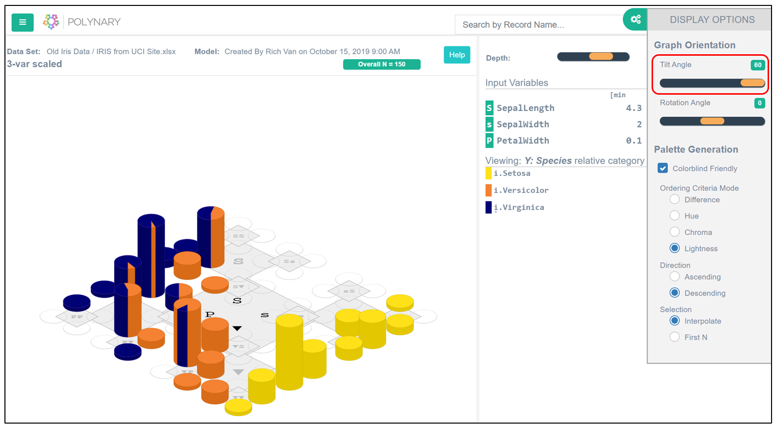
The bar heights reflect the relative number of plants in each basin. It is clear some basins are more typical of each kind of Iris than others. [In Tools menu move the Tilt Angle slider to 60.]
Fig. 2.1: Tilt Angle
Next, notice that some basins have pie slices shown in two different colors. These are basins that contain more than one category. The relative size of the slice indicates the relative fraction of Irises of that kind that fall into that given basin. This adjusts for the possibility that the total number of Irises of each kind might differ. Larger pie slices indicate the basin has a disproportionately larger number of members belonging to that category.
Zooming
We see the same entire data set in greater numeric detail by changing the Depth Slider to 4 (Figure 3). The Figure 2 divided the input space into 64 basins. This means that, on average, a basin covered about 1.6% of the space. With the Depth slider at 4, the space becomes divided into 256 basins; each covering, on average, 0.4% of the space. This percentage provides a useful sense of the precision offered by a graph. Irises falling into the same basin quickly become more similar as their corresponding Polynary strings become longer.
Figure 3: Zoomed Detail of entire Graph shown in Figure 2.

While this latter graph shows the data in greater numeric detail, the data patterns that distinguish Irises exist at larger size-scales than individual basins. For instance, Iris setosa (yellow basins) occur along the lower-right edge of the graph. This corresponds to wide variation in Sepal Width with relatively short Sepals and narrow Petals. And members of Iris virginica (blue basins) occur mostly along the upper-left edge where Petal Width is relatively wide, and Sepal Length is long.
Lastly, examining the dominant cluster of Iris versicolor (orange basins) in the region of the graph (bottom quadrant) [Click on the center of this quadrant to zoom in] to displaya graph of that region in even greater numeric detail.

Figure 4: Refined Details of Iris data in the -Regio n of the Graph in Figure 3.

In the zoomed graph (Figure 4 above) notice that the orange basins cluster in locations that correspond to the blue basins in Figure 3—along the upper left diagonal. This Indicates that i.versicolor (orange) is similar to i.virginica (blue) but scaled down with proportionately narrower petals and shorter sepals.
Polynary graphs provide the means to visualize the empirical patterns in high-dimensional spaces. In this example, it’s how these Irises differ. The goal of this presentation is to offer an approach to characterizing these differences more formally.
The historic route to discovering these structures in high-dimensional data came through statistical modeling with the results expressed in terms of the values of the estimated parameters of its model terms. But this form of reductionism was never very satisfactory to a wide audience. The Discriminant equations at the beginning of this presentation allow predictions of individual cases, but they don’t really tell us how one kind of Iris differs from another. [In the left menu click Y-Frame Classification]

Here we use polynary methods to partition the Iris data into 5 generalizations that distinguish the types of Irises.
Figure 5: Descriptions Distinguishing Iris kinds from values of Petal Width and Sepal Width and Length.

Details about how the particular clusters on the Figure 5 graph were formed is beyond the scope of this presentation. The rationale is the same method of natural clusters used in Description problems—generalized to handle multiple categories. Suffice it to say that the method sequentially joins basins to clusters to maximize the amount of accurate information conveyed by the resulting description of the cluster. Ordering the joins in this way assures that the set of descriptions displayed are optimally concise regardless of the percent of entire sample we choose to characterize. This method makes no a priory assumptions about how the data are distributed within the conceptual space.
Core % Cases slider
The clustering method makes the Core % Cases slider an important tool when we want to make descriptions that cover just the more typical cases. For example, interactively we can [slide the Core % cases from 100% to 62%].

At this setting we can determine that the majority of Iris versicolor cases fall into just four (pink) basins. And by [left clicking on any pink basin and right clicking on Classification] we get additional information about this single spatial region in a pop-up box. We present the resulting information in Figure 6.
Figure 6: Describing a majority of Iris versicolor cases using the Core % Slider.

We can paraphrase the description of the pink region in Figure 6 in more natural language as:
The majority (26/50) of Iris versicolor have Sepals that are somewhat short to barely long, Petals of moderate width, and Sepals very to somewhat narrow.
The region denoted by this cluster covers 6.3% of the conceptual space; and the description connotes this region with an accuracy of 86.5% based on how 100 native speakers of English understand adverbs. The claim that the Irises so described are likely I. versicolor is based on the observation that 78.8% (26/33) plants in this region are members of this kind
By contrast the more comprehensive description of the pink region in Figure 5 is: 80% (40/50) of Iris versicolor have Sepals that are very to somewhat narrow and are somewhat short to moderate in lengtth. The widths of the Petals are broadly moderate.
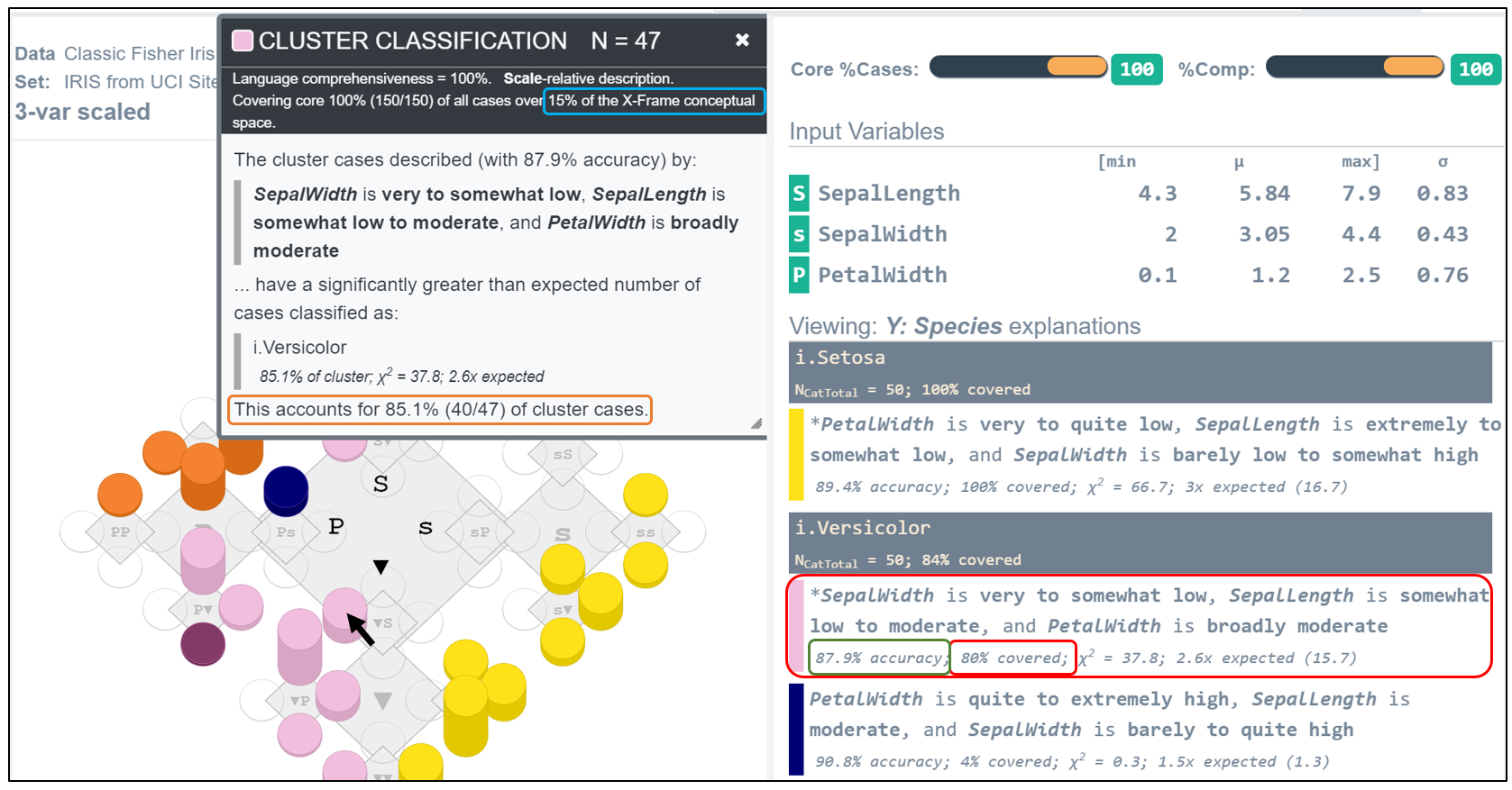
Based on its Cluster Classification box, the region now covers 15% of the conceptual space, and the description connotes this region with an accuracy of 87.9%. The claim this description best characterizes i.versicolor is based on the observation that 85.1% (40/47) of the Irises in this region are members of this kind.
The latter description covers a region over twice the volume of the first. And their descriptions connote the differences in their location, size, and shape of this cluster. The importance of the Core % Slider is that it gives the user the ability to chose the level of comprehensiveness by which the data are characterized. And regardless of the level chosen the resultant descriptions are optimally concise.
%Comp slider
Another flexible feature of language rests in our ability to form descriptions that provide only the amount of detail needed to draw the necessary distinctions. By default, the initial descriptions displayed by the program are complete; they reference every dimensional feature. Briefer descriptions may be enough to distinguish outcomes, and are simpler to remember. The %Comp Slider gives the user interactive control over the degree of completeness of the descriptions.
The order of the adverb-adjective phrases in a description is determined by how much accurate information they convey. When we move the %Comp Slider to 70% we see in Figure 7 that each description cites only two of the three dimensions while preserving at least 70% of the information in the complete description.
Figure 7. Using the %Comp Slider to make Descriptions Briefer

For example, the paraphrased characterization of i.setosa in the model of Figure 7 becomes: “Compared to the other Irises, setosa have petals that are very to quite narrow and sepals that are extremely to somewhat short.” Note that the act of making descriptions briefer does not make them less true, just less complete. The real aim of this analysis is to provide enough information to draw distinctions between Iris kinds. And to this end, the briefer the better.
The Core % Cases slider and the %Comp slider can be used in combination to mirror the kind of flexibility people use when they describe things.
Interpretive Contexts
Doctor: “Your blood pressure is quite high”. Patient: “Quite high relative to medical standards or your other patients?” Doctor: “Medical standards, compared to my other patients your blood pressure is only somewhat high.” We have all asked for clarifications like this. The interpretive context changes the description. Are you comparing your height to the general population, or to NBA basketball players?
The current program supports two interpretive contexts, rank and scale. By default, we replace the values of each dimension by their rank value—tied values given the same rank. We then convert the ranks to range between zero and one. This default can be overridden in the model Builder.

Unchecking the Rank Variables box means scaling an observed value between zero and one based its position relative to the minimum and maximum value of its dimension.
Ranking results in a (rather) uniform distribution of cases whose values are understood as positions relative to other cases. Scaling preserves the underlying distribution of cases whose values express their position along an interval of scale. The choice informs the interpreted meaning of the resulting descriptions.
The results presented earlier are all based on scaled data. We will leave it to the reader to compare these results to those of the scaled context in Figure 5 to the ranked data presented in Figure 7 Ranking will generally draw a greater number of distinctions at any given graph resolution.
The choice of the interpretive context depends on the given analytic problem. In common situations each dimension is a different concept where there is no direct comparison of values between different kinds of rulers. The best we can do is to give the values a common interpretation in terms of a fraction of a way along their ‘interval of scale’ or ‘rank position’. It is only through setting the context that quantifying adverbs have meaning. Both contexts result in the unit-cube framework of a conceptual space where the dimensions have no units of measure. But the interpretive context changes what we see in graphs and say in words. Users are encouraged to experiment to determine the most useful method in any given data problem.
Figure 7 Descriptions Distinguishing Iris kinds from Ranked values of Petal Width, Sepal Width and Sepal Length.

Summary Remarks
Traditional analytic methods can be a barrier that inhibits what we gain and who benefits from our data resources. Statistical modeling is a technical art that few will learn, and their results often mean little to the clients they are meant to serve. Models are a filter between the empirical data and the conclusions drawn from them. The polynary approach is more direct, exposing the patterns and relationships in empirical data to the visual system and expressing the results in a language that people already understand. The aim of polynary is to advance and democratize the use of data for learning and better decision making.
The Polynary representation characterizes an object by the relative salience of its dimensional features—by what most stands out about it. This allows us to graph high-dimensional data on a two-dimensional fractal graph. The utility of a graphical frame of features rests on the patterns that the data forms on it. If there were no real differences between the Irises in this example, we would expect the colors to be randomly distributed. This example demonstrates otherwise, enabling us to see patterns that allow us to distinguish categories based on three measurements. Polynary offers an effective new approach to this kind of problem of how to tell different categories of objects apart.
A visual picture is a great starting point, it offers transparency to the empirical evidence in a very compact form. Historically the lack of high-dimensional visualization made this impossible. And importantly, any conclusion or inference made from these data cannot be inconsistent with the polynary graph. But visualization is not enough. We still need to articulate what distinguishes these categories.
Traditional mathematical rules may be effective for predictions of individual cases, but they are rarely telling. Mathematical answers in the form of equation parameter estimates and other statistics are a form of reductionism that focuses at the level of variables (or model terms) rather than individual objects. This fragments an object into pieces, re-directing our attention to the task of rejoining them by ‘weighting’ the individual parts.
Lay people don’t do it this way. Brain math is multivariate; it properly recognizes an object is an indivisible unit with multiple properties. How we use words to describe objects reflects this. We understand objects described the same way as similar, and objects described differently as different; this is how people draw distinctions.
The premise of Polynary is that the real endgame of data analysis is to turn numbers into words with legs. Our eyes and language are the currencies of communication, not math. And the goal of most statistical studies is to express conclusions in the form of generalizations that we can share with others. Polynary offers a human-friendly approach.
© PolynaryThink, LLC 2019 All Rights Reserved