
A common task in data analysis is model building. Models are used to understand how a set of measured variables explains other variables. These commonly are commonly known as regression problems.
In the low-dimensional world -- when there are only one or two input variables and only one outcome—you can graph the data to see the relationship you are trying to model. You can see how the outcome variable trends, bends, and twists in relation to the input variables. And from such geometric features you can learn to write down an appropriate model.
Beyond more than 3 input and output variables we enter a high-dimensional world. These are abstract spaces. We can’t see them, and our geometric reasoning fails us. Who knows what patterns and shapes a high-dimensional swarm of points might take?
High-dimensional modeling is an endeavor of the blind. And making matters worse, most modeling efforts lack a theoretical basis to guide the form of the model itself. Modeling in the high-dimensional realm is a technical art that excludes most people.
Polynary graphs show high-dimensional input spaces on a coordinate system laid on a two-dimensional surface that reveals the connections between the inputs and outputs in your data. This helps analysts evaluate how well their model captures data patterns—and suggest how they might be improved.
The graph in Fig. 1 shows hypothetical data involving 3 input variables labeled A, B, and C, and one outcome variable named Y.This example has a total of 4 dimensions.
Fig. 1 Average Y in Data

We see the coordinate system for the three input variables with the average Y value represented by the height of a bar for each Polynary basin on the graph. We also color-coded these average Y values according to the value ranges shown in the legend on the right.
We can simplify the graph visually by reordering the Input variables on the graph. We do this manually by swapping variables. While this new graph (Fig. 2) looks different, it is just a reorganization of same the graph.
Fig. 2 Graph of the data with position of quadrants B and C swapped

It is easy to see the overall trend in this graph. The yellow basins cluster in the lower-left, the blue basins along the upper-edge, and the orange basins are scattered in between.
How well can a model replicate this data graph? Let’s assume, as commonly done, that the model is linear in A, B, and C. We run the regression model and it returns the following equation: Y(LinModel) = 4 + 4A – 2B + 5C + residual. The residual for each case is the difference between the observed and model predicted value of Y. The R-square for this regression model is 0.69, indicating that 69% of the variation in Y is accounted for by the model.
That’s a pretty respectable R-square in many domains; can we pack up and go home? How can we evaluate whether this model captures all the essential pattern in the data?
The answer is simple, let’s first compare how well this model reproduces the same pattern found in the data.
Fig. 3 Average Y from Data Fig. 4 Y = 4 + 4A – 2B + 5C + residual

It certainly looks similar. But the better test is to look at the residuals—the error the model doesn’t account for. While a model is ‘fit’ to minimize the residuals, any pattern in these residuals indicates information that the specified model did not capture. Let’s examine a graph of these residuals.
Fig. 5 Polynary graph of the linear model (residual) error term

Notice the ridge of 7 high residuals, the blue-colored basins, up the middle of the graph. And observe how the bar heights shorten in both the A and B directions.
Fig. 6 Redraw of Residuals of Fig 5 with less tilt angle

And notice that the 11 yellow-colored basins of residuals in Fig. 6 are spread around the edge of the graph. If our model was correct, we would expect the blue and yellow colors to be randomly distributed across the graph. It appears they are not.
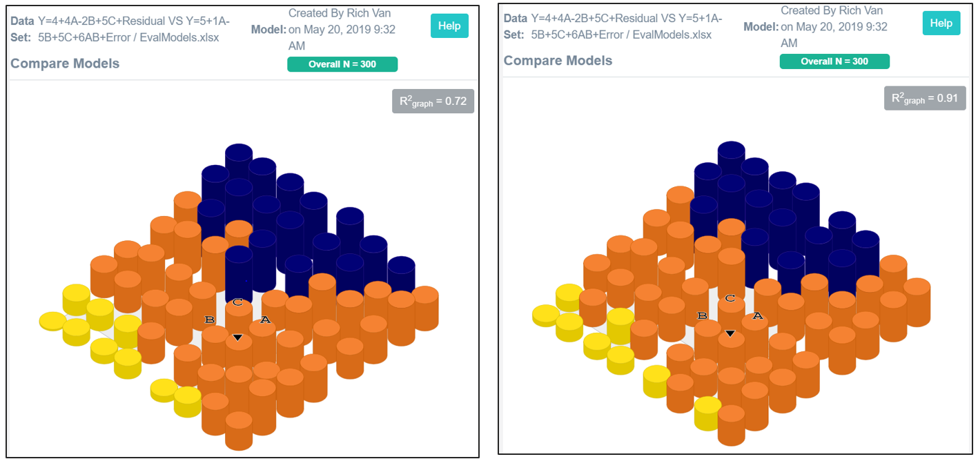
This graph indicates that the value of Y is not a simple linear model—the hyper-plane of our first model has a warp to it. More specifically it suggests an interaction term involving A and B would improve our model. A new model that included this interaction term yielded Y(IntModel) = 5.53 + 1A -5B +5C + 6AB + error. The predicted Y for the linear and interaction models are shown in Fig 4 and 7 below.
Fig 4 Y = 4 + 4A – 2B + 5C + residual Fig 7 Y = 5.53 + 1A -5B +5C + 6AB + error.

We again saved the predicted Y value and error associated with each data case; then created a new Polynary data set. We compare the linear model residuals with the errors of the interaction model in Figures 6 and 8.
Fig 6 Average Residual in Linear model Fig 7 Average Error in Interaction model


The linear model (Fig. 6) had 11 yellow-colored basins, now there are 5 (Fig.8). There were 7 blue-colored basins before now there are 6. These two colors represent basins with large errors. The interaction model has more orange-colored basins with errors more closely bracketing zero. Finally, using the tilt feature we see that the bars are more uniform in height.
Fig 9 Residuals of linear model tilted 60° Fig 10 Errors of interactive model tilted 60°

The R-square of the interaction model accounts for 74% of the variation in Y while in the linear model it was 69%. A 5% gain in model fitness may seem modest but the point to make here is that even modest gains can be visually detected and remedied using Polynary visualization. We close with a comparison of the average observed Y-values and the predicted Y from the interaction model in Figs 11 and 12. The two graphs are similar.
Fig 11 Y Average Observed in Data Fig 12 Y = 5.53 + 1A -5B +5C + 6AB
We have shown some principles for how Polynary graphs can be used to help model data through the visualization of model residuals. It should be clear that this technique can be applied to higher-dimensional and more general types of models. Currently this requires the user to export predicted values and their residuals to Excel files for import into the Polynary program.
It is said that statistical modeling is complete when you run out of time, money, or ideas to try. We are offering a labor-saving tool for analysts to use in building and fine-tuning mathematical models. When the residuals show no pattern, there is no additional information to exploit—no model of that type will improve it.
Analysts often wish they could see client data. That would enable clients to see and share the empirical evidence behind their decisions and claims directly. Model equations like: Y = 5.53 + 1A -5B +5C + 6AB + error symbolically proport to summarize the relationship between a set of inputs and an output. But equations often mean little to clients. And their conventional interpretation, expressed as ‘effects’ of individual model terms, fragments the understanding of their net effect.
We can show this model directly and in greater detail.For instance, we can use the slider to break the predicted value of Y into 7 Intervals and move the slider for Depth =4 as shown in Figure 13.
Fig 13 Y = 5.53 + 1A -5B +5C + 6AB at Depth 4 and 7 levels of Y

Notice that R-square graph is at 98%. This is calculated through the heights of the basin bars. The reason this value is so high is because at this resolution depth there are 256 potential basins and a sample size of 300. Most of these basins contain just one or a few observed values of Y. This brings up a final point. The shown graph is close to a picture of the raw data itself. Why not bypass modeling and show the data itself?
Fig 14 Average Y value of the Data at Depth 4 and 7 intervals

Whatever the conclusions drawn from the data, they shouldn’t be inconsistent with the visual evidence. Nothing beats a picture.
© PolynaryThink, LLC 2019 All Rights Reserved